


Understanding air pollution in Oakland
Pollution in this Bay Area city can vary dramatically block by block, based on time of day and location. And that can have a significant impact on human health.
New sensor technology allowed EDF scientists to collect data in innovative ways using Google Street View cars and dense stationary networks. With the help of our partners, we were able to see how changes in air pollution lead to health disparities, especially among the elderly.
Why new technology is critical for tackling air pollution around the globe
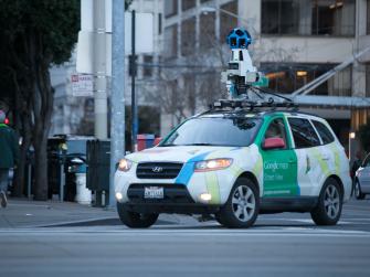
Google Street View car shows neighborhood pollution
What we did: Drove every street and highway in Oakland an average of 30 times for 11 months, using specially-outfitted cars by Aclima to collect nearly three million unique air quality measurements.
What we found: Air pollution is not evenly distributed and can in fact be up to eight times worse on one end of a city block as another.
Dense sensor networks show pollution’s spikes over time
What we did: Installed 100 sensors throughout West Oakland and continuously monitored black carbon for 100 days.
What we found: Pollution increases and decreases based on both location and time of day.
Health data combined with pollution maps show impact
What we did: Combined data from the Google Street View project with Kaiser Permanente’s electronic health records of over 40,000 people in Oakland to better understand how location affects health disparities.
What we found: Living in areas with the most elevated levels increases heart attack risk in the elderly by 40 percent, similar to a history of smoking.
Smart policies can reduce pollution’s local impacts
What we know: Federal, state and local air quality protections, as well as private-sector measures, can make an enormous difference in protecting health.
How our research is making a difference: As California implements its landmark air quality law seeking to reduce pollution in the state’s most affected neighborhoods, Oakland residents and local environmental justice groups are using our findings to advocate for safeguards to clear the air and foster healthier communities.
Our experts
-

Vice President, Science Capacity and Innovation, Office of the Chief Scientist, Deputy Project Lead, MethaneSAT
MEDIA CONTACT
Cecile Brown
(202) 271-6534 (office)