


Our work
Delivering bold climate change solutions
The Earth gives us everything we need to live vital lives, and we have the power to sustain it.
Yet, the Earth’s vitality is disappearing. The human health consequences, flooding, drought, extreme weather and economic devastation caused by climate change are accelerating.
EDF’s expertise in science and economics enables us to deliver bold, game-changing solutions to help people facing climate threats today while curbing climate pollution for a better tomorrow.
Everything EDF does is to ensure a vital Earth. For everyone.
Our work pinpointing the biggest opportunities for change
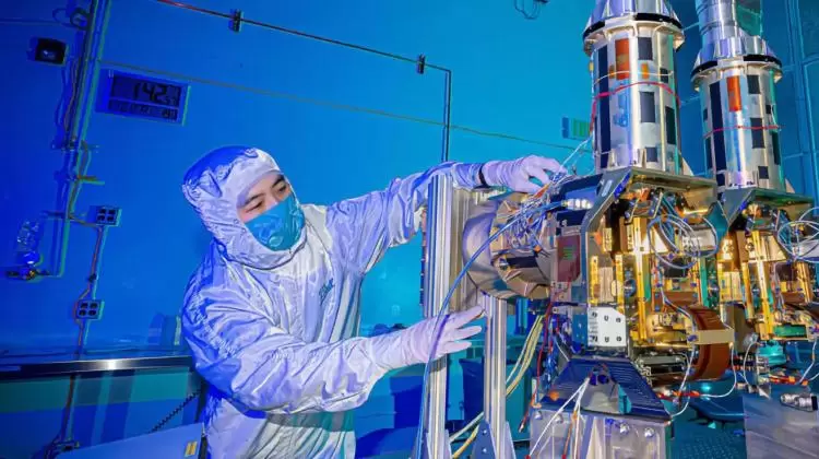
Energy transition
We’re working with government, industry and a wide range of partners to catalyze the transition to clean and modern energy for everyone, toward a zero-carbon future.
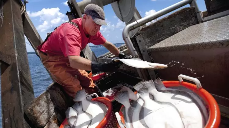
People and nature
We’re ensuring that communities can withstand current climate impacts, while bolstering nature itself as a much bigger part of the solution.

Healthy communities
We’re partnering with communities, companies and governments to improve our air and water quality, deliver safer products, and incentivize innovations.
Highlights of our top goals
In this critical decade for the climate, it’s now or never. Our goals reflect this urgency, as we prioritize action in communities that are most burdened by pollution. By 2030, we aim to:
-
Slow global warming by cutting methane pollution 40%-45% from big global sources, including oil and gas and livestock.
-
Slash carbon dioxide pollution by making 80% of the CO2 cuts the world needs to limit climate change’s worst impacts.
-
Make sure hydrogen is a safe alternative fuel by creating guardrails for using it, benefiting the climate and communities.
-
Help the land and oceans feed us , so 2.5 billion people benefit from climate-resilient, equitable food systems globally.
-
Build resilient water supplies, so over 40 million people in the Western U.S. have sustainable access to clean water.
-
Drive down air and climate pollution, so 1 billion people in some of the world’s most polluted cities breathe cleaner air.
-
Move the world toward safer chemicals, reducing people’s exposure to the highest-risk chemicals by 30% in the U.S.
See more in our Vision 2030 report
Impact by the numbers
-
0M
Acres that have protected 63 rare species, thanks to EDF’s efforts to give landowners incentives to help wildlife
-
$0.0B
The amount in energy savings EDF Climate Corps fellows have uncovered for top companies since 2008
-
0+
Countries around the world where EDF works with partners and allies to solve the most critical environmental problems